Voice Match OOBE
Motion Design is a powerful tool that can greatly enhance the user experience of an onboarding flow. By incorporating engaging animations, users are able to experience a sense of delight and positivity while interacting with digital products. This is precisely the experience we aimed to create when Google approached us to redesign their OOBE assets for the Voice Match feature.
As the Motion Designer on the team, I helped create a seamless and visually appealing onboarding process that is sure to leave a lasting impression on users.
Credits
The Ask
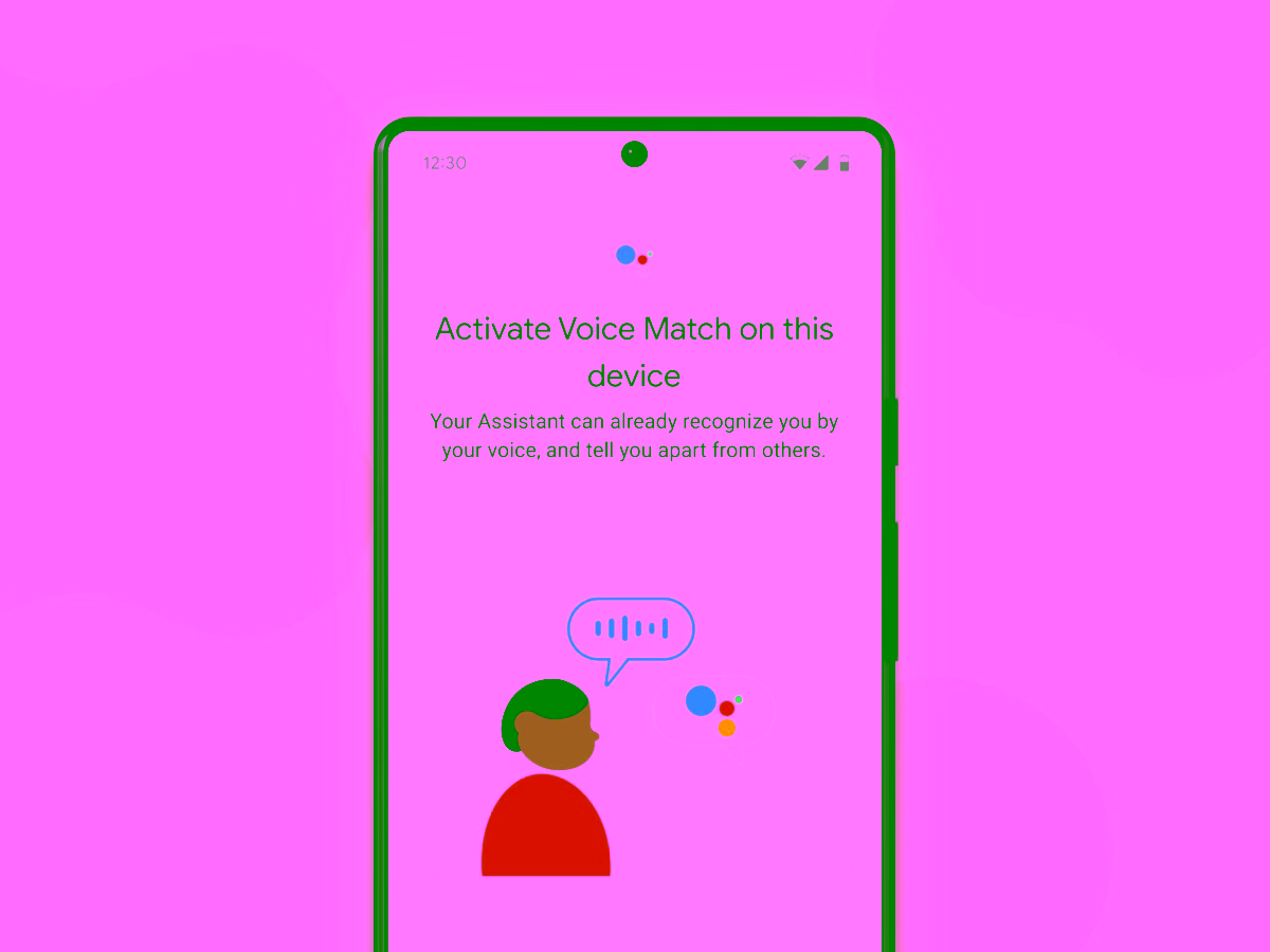
In response to a request from the Assistant team at Google, we were tasked with updating the OOBE assets for the Voice Match feature. These assets were outdated and required a redesign to align with the new illustration style used in Android interfaces.
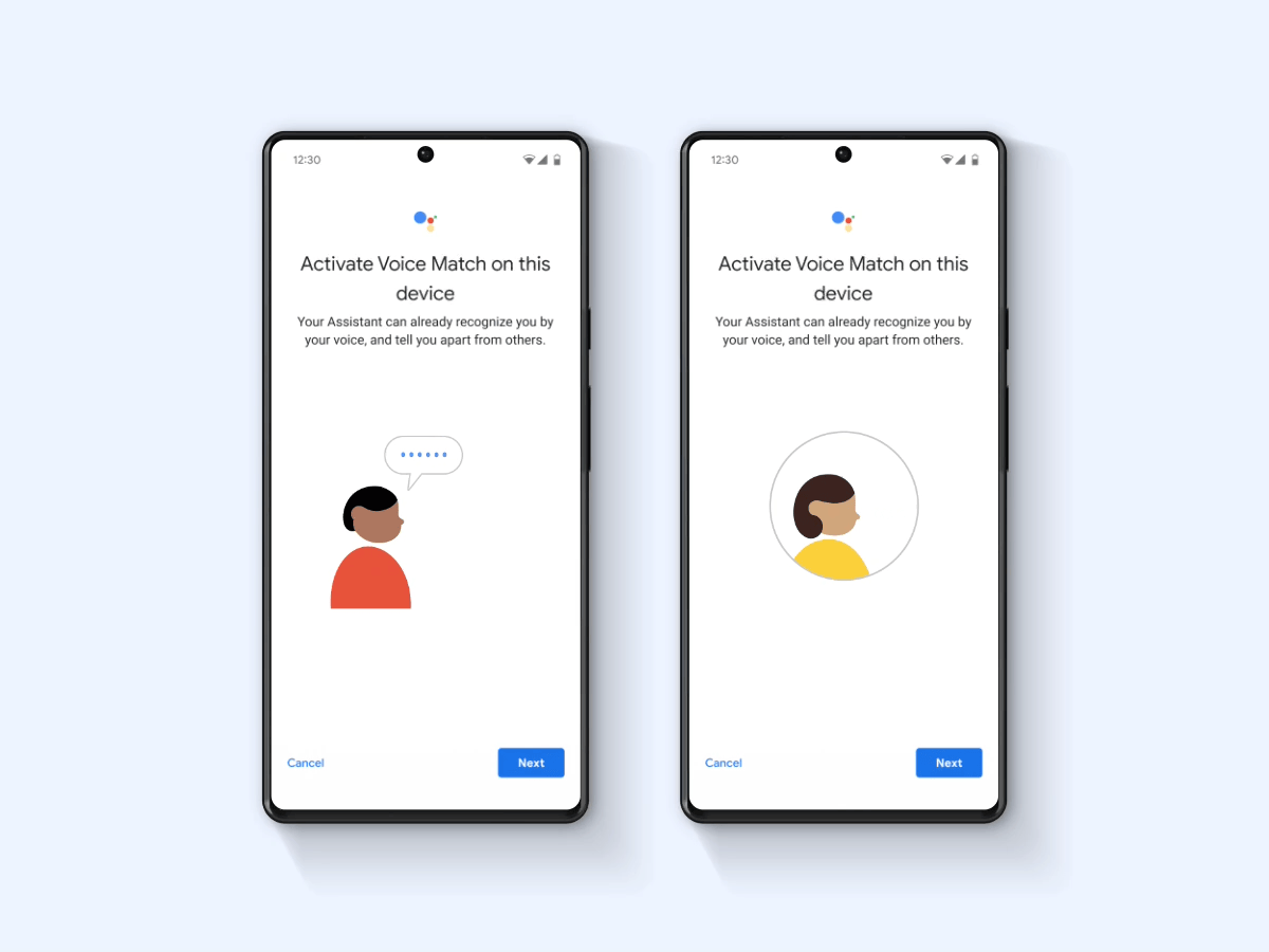
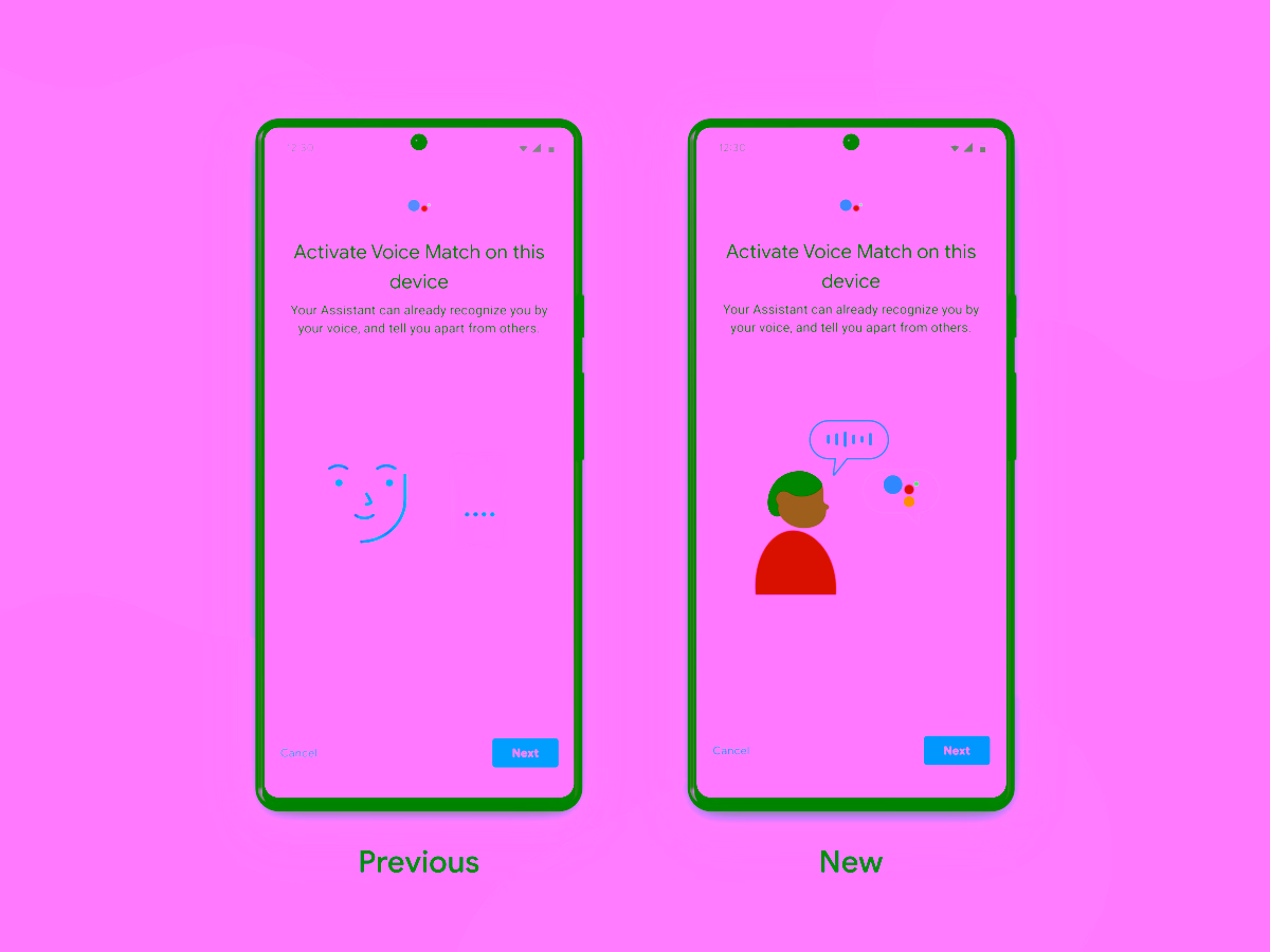
The previous design utilized an abstract, outline-style illustration. However, with our new style, we recognized the potential to be more inclusive by incorporating a range of skin tones and creating a character with a more welcoming appearance.
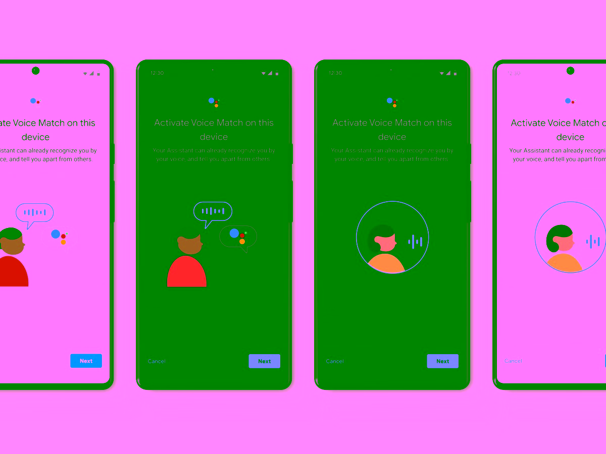
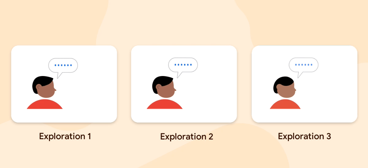
We conducted extensive explorations on various levels of expressiveness and exaggeration in our animations. Through this iterative process, we were able to refine our techniques and create natural and expressive movements that align with Google's motion guidelines.
Our efforts have led to an improved user experience, a reduced bottleneck by utilizing efficient Lottie assets, and a cohesive visual aesthetic in alignment with other Android teams.